Voyager
Kotahi Business Transformation
- Client
- Kotahi Logistics LLP
- Role
- Lead UX/UI Designer
- Duration
- 3 years, ongoing
- Tools
- Figma
Open
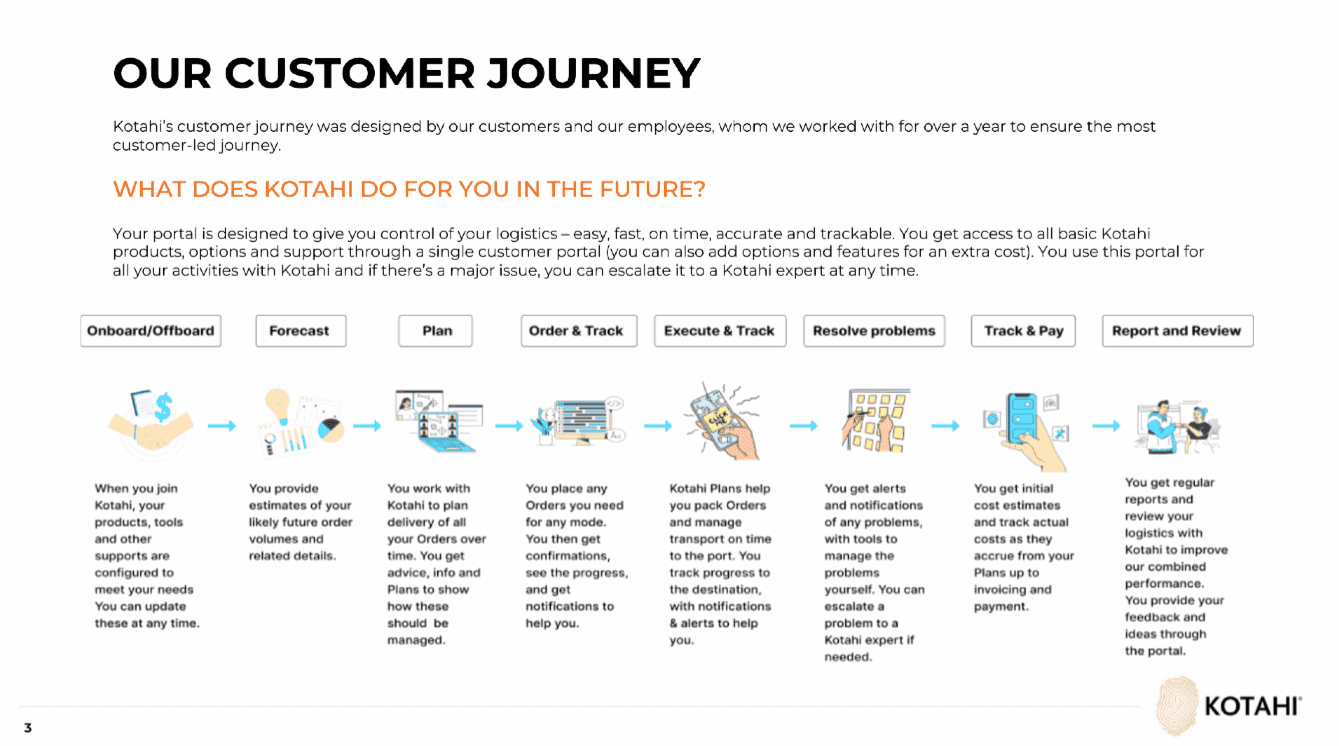
Kotahi moves about 30% of New Zealand’s containerised exports for more than 50 primary exporters. The tools behind that were four customer portals and 27 systems, most of them manual.
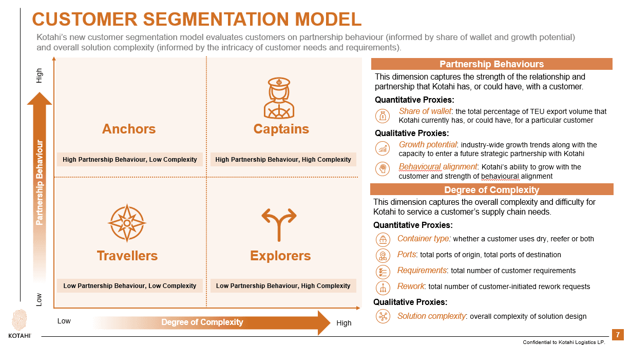
I was lead UX/UI on Voyager: collapse that into one live experience without taking operations offline. The two jobs that mattered were create a new order, and see the ones already in flight.
- Problem: Four customer portals and 27 systems. Create Order was one long form. Status and disruptions arrived as email.
- Role: Lead UX/UI, Kotahi Logistics LLP, January 2023–now. Team: PM, Scrum Master, Senior BA, engineers, Data and Insights, architects, SMEs.
- Constraints: Live operations stay up. Salesforce Lightning plus Kotahi brand. Hazardous (DCSA) and reefer-plus-own-container need extra fields without dumping them on every exporter.
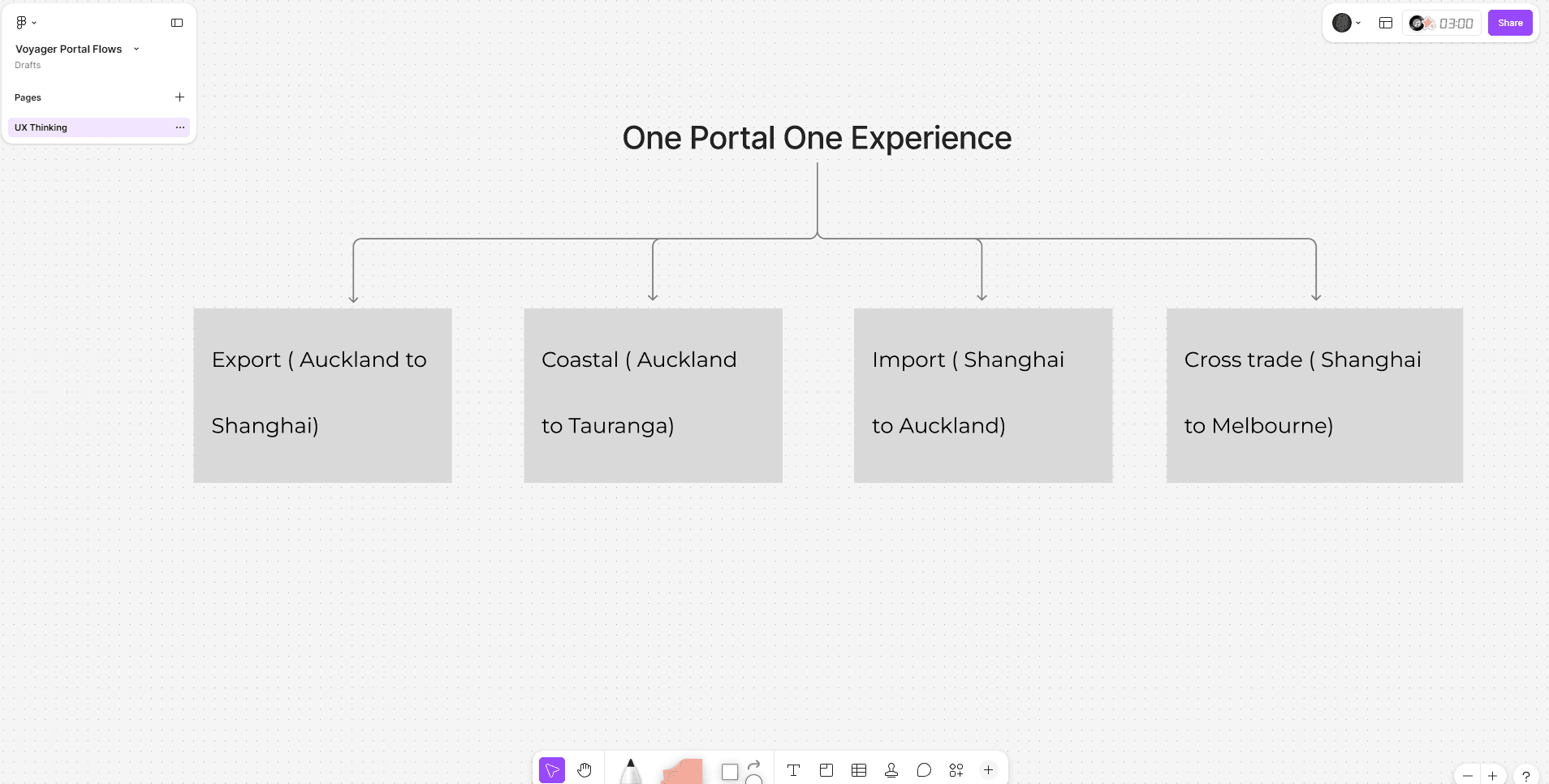
- Decision: One portal. Sequential Create Order. View Order plus in-product notifications and disruption banners instead of the inbox.
- Impact: View Order cut order-visibility enquiries by 50%.
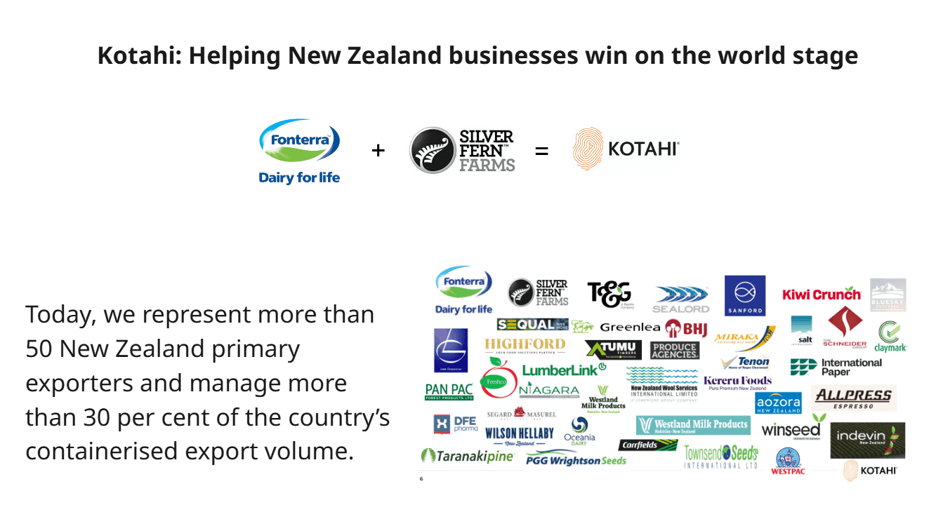
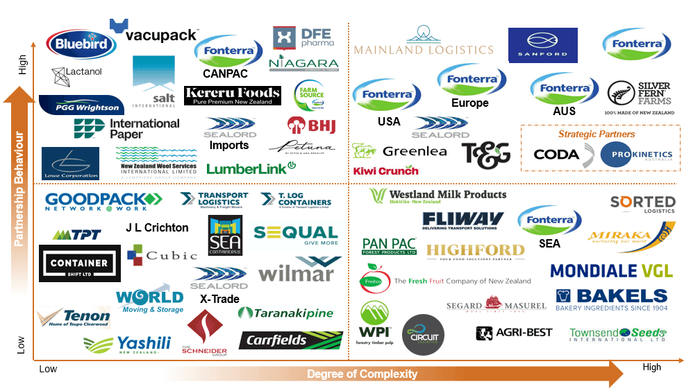
- Scale (org / programme, not a product delta): 50+ NZ primary exporters; about 30% of New Zealand containerised export volume. Kotahi is a Fonterra and Silver Fern Farms subsidiary.
30%
of New Zealand containerised export volume (Kotahi scale)
The problem
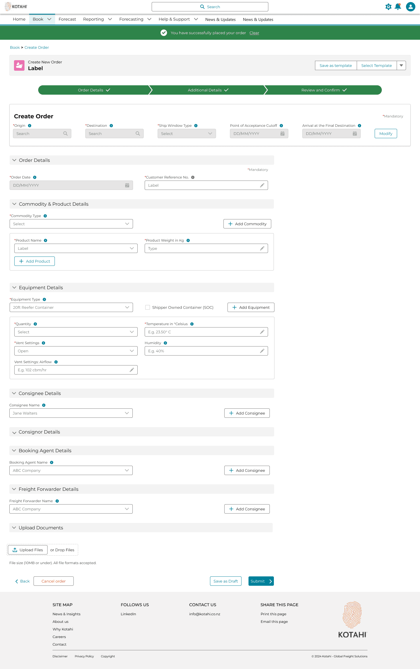
Exporters created orders in a single long form that ignored product type. Hazardous goods (DCSA) and reefer-plus-own-container needed extra fields; everyone else still had to wade through them.
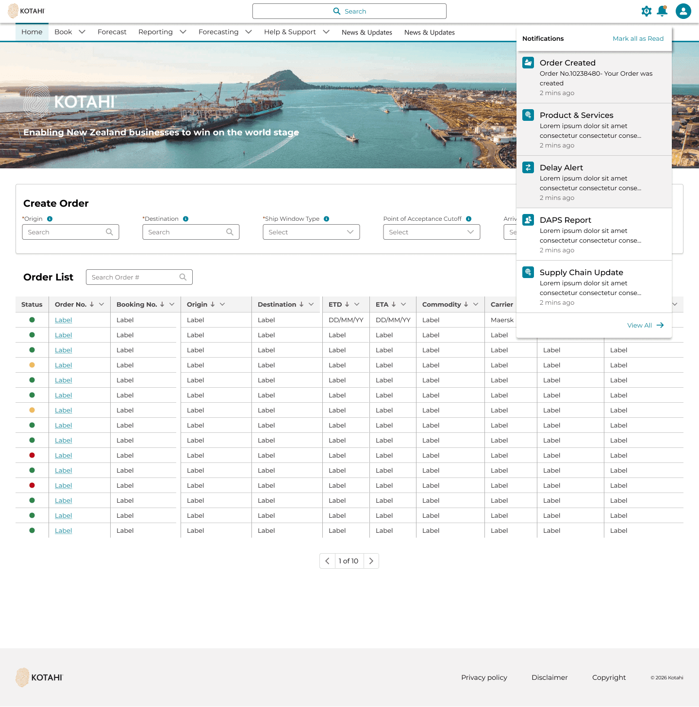
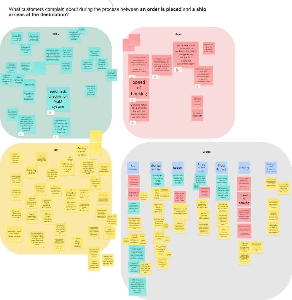
Order status and disruption alerts arrived as emails. People missed them, then rang Kotahi. There was no place in the product to see a live order.
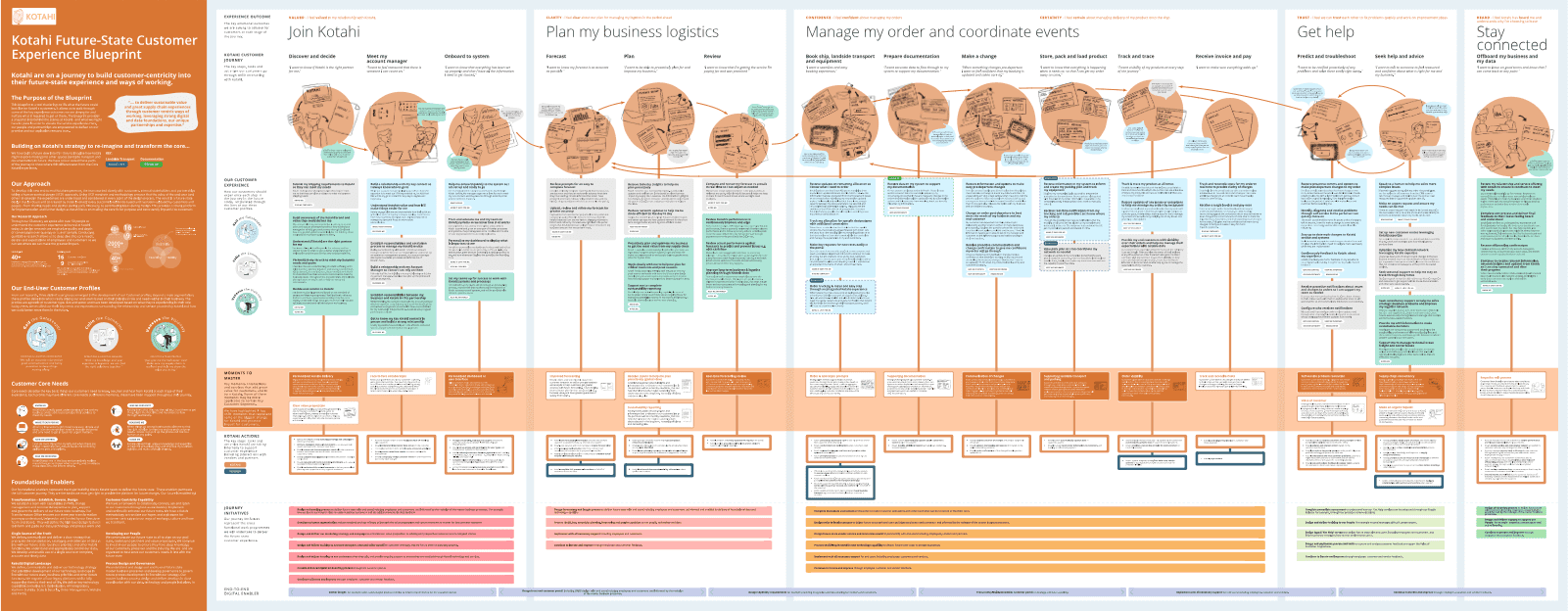
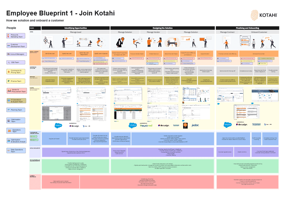
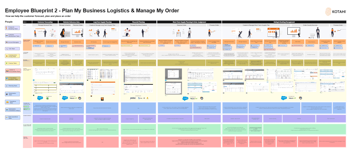
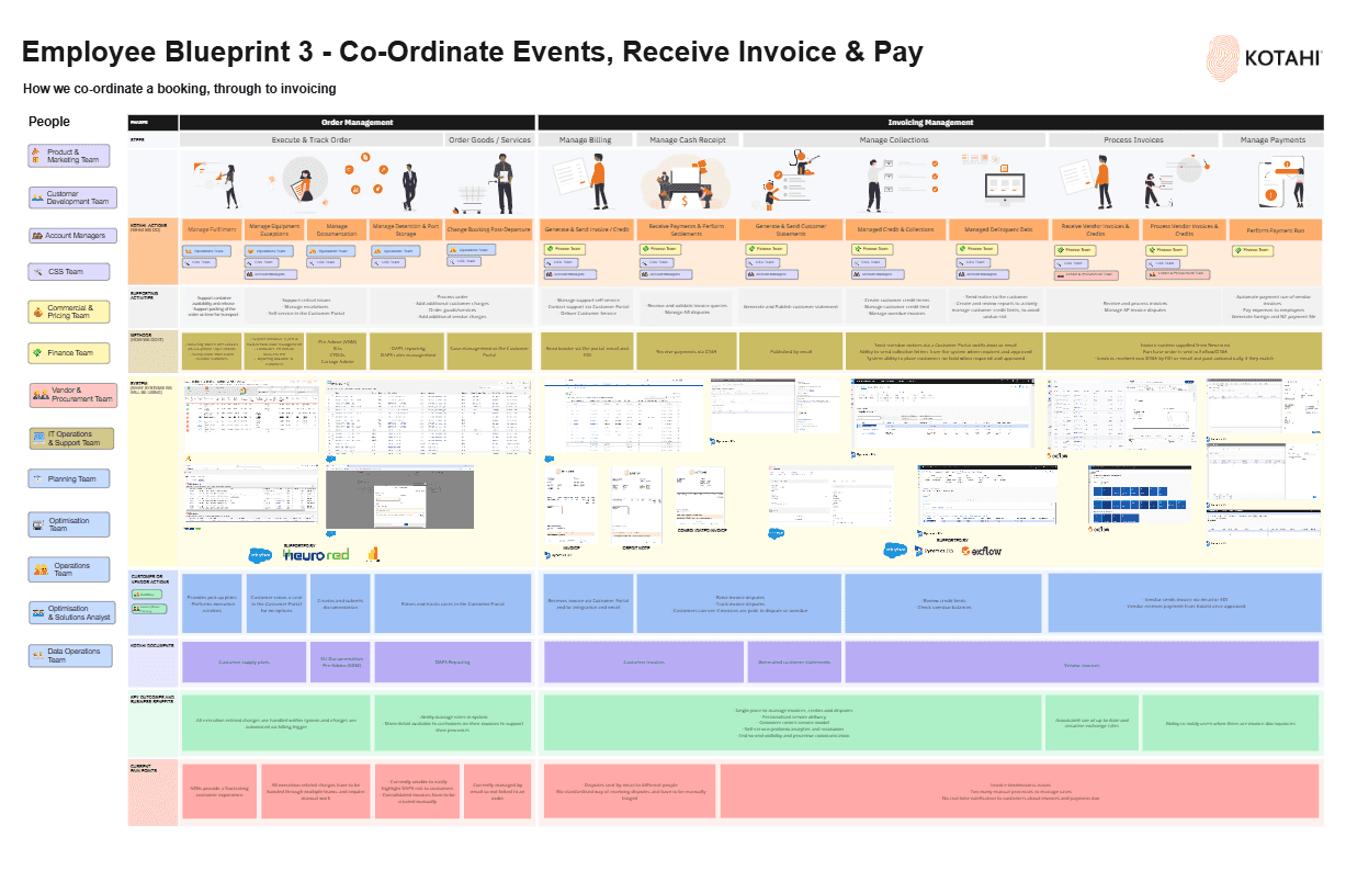
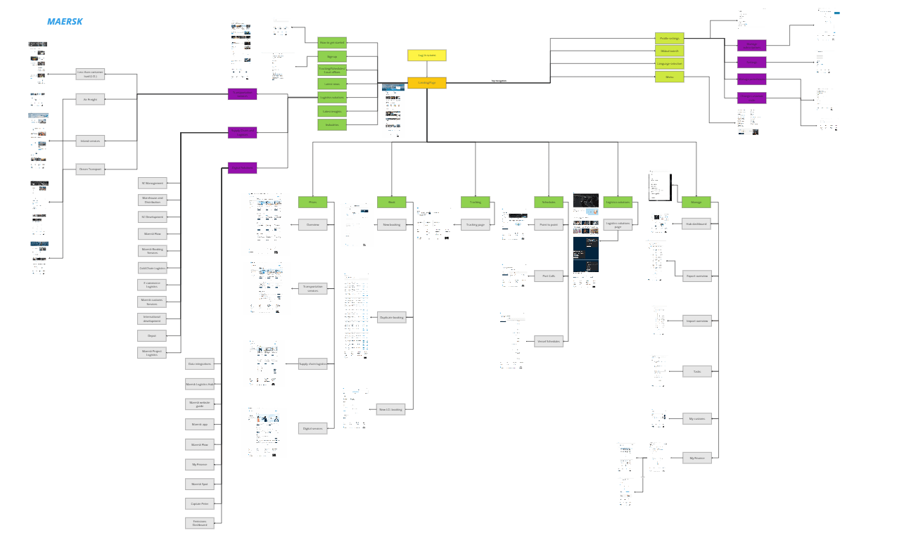
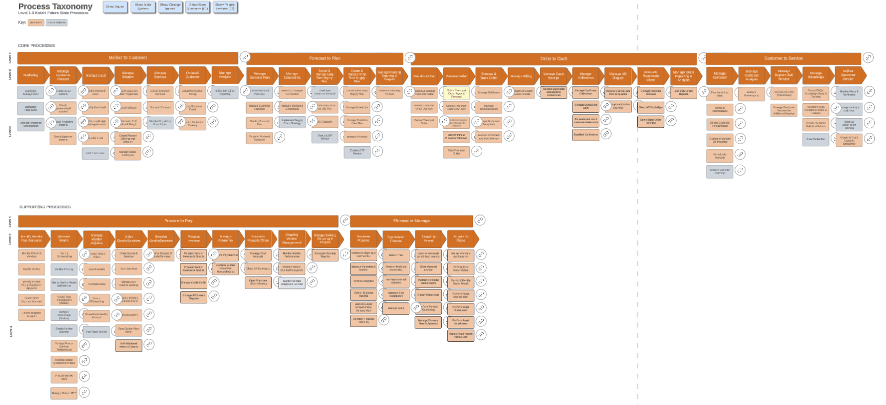
The programme sat inside a wider Kotahi transformation: future-proof the tools and make them AI-ready, without losing what each legacy system actually did.
Insight
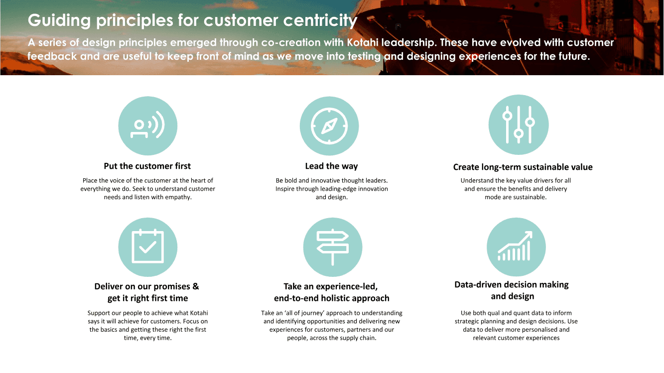
How might we consolidate 27 systems into a unified data architecture and collapse 4 customer portals into one coherent experience without disrupting live operations or losing the nuance each legacy system carried?
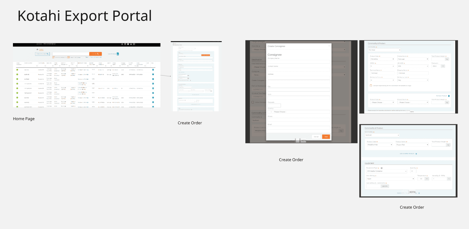
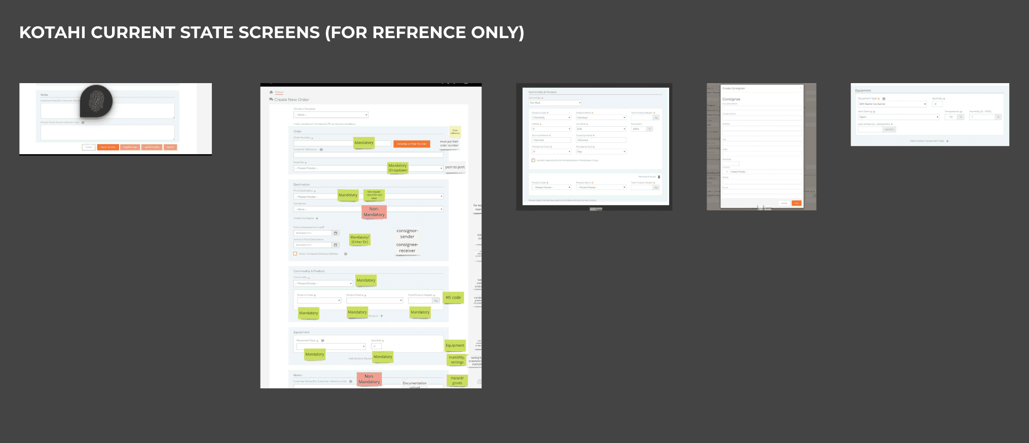
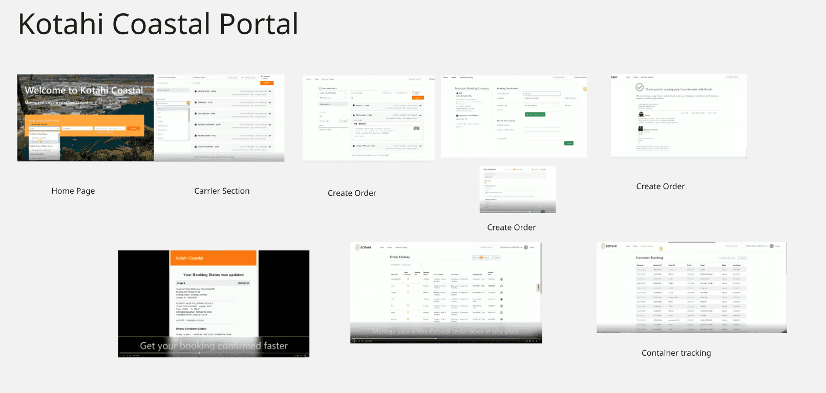
Create Order
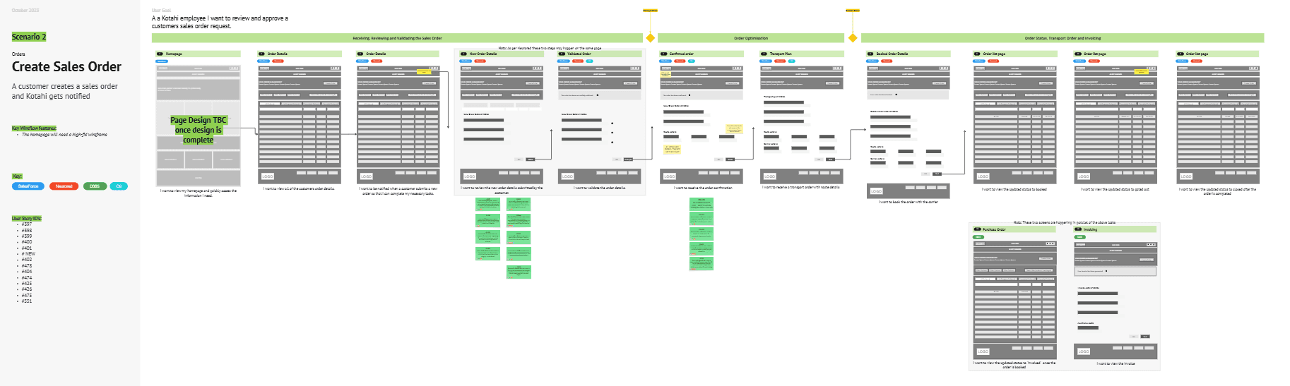
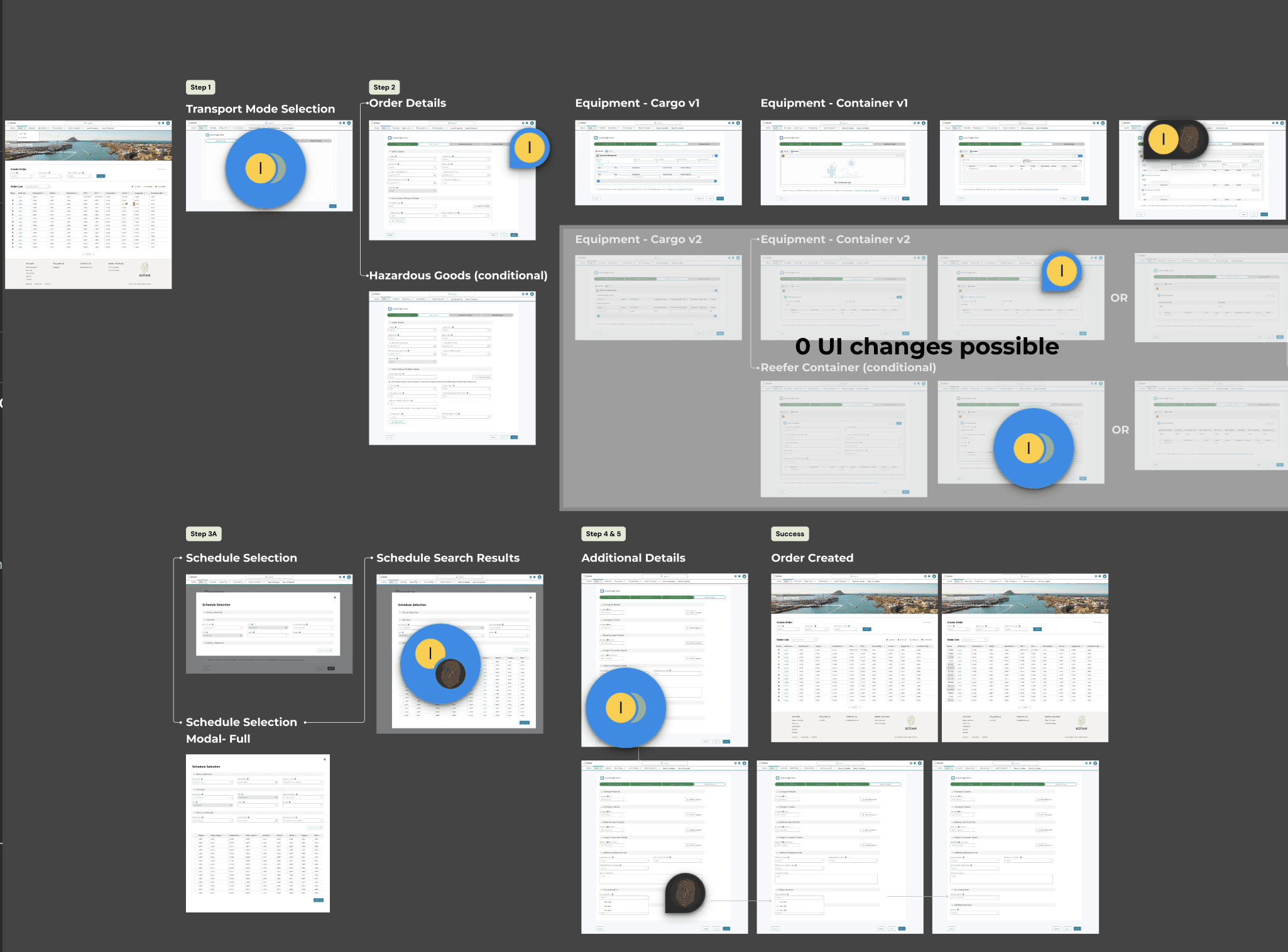
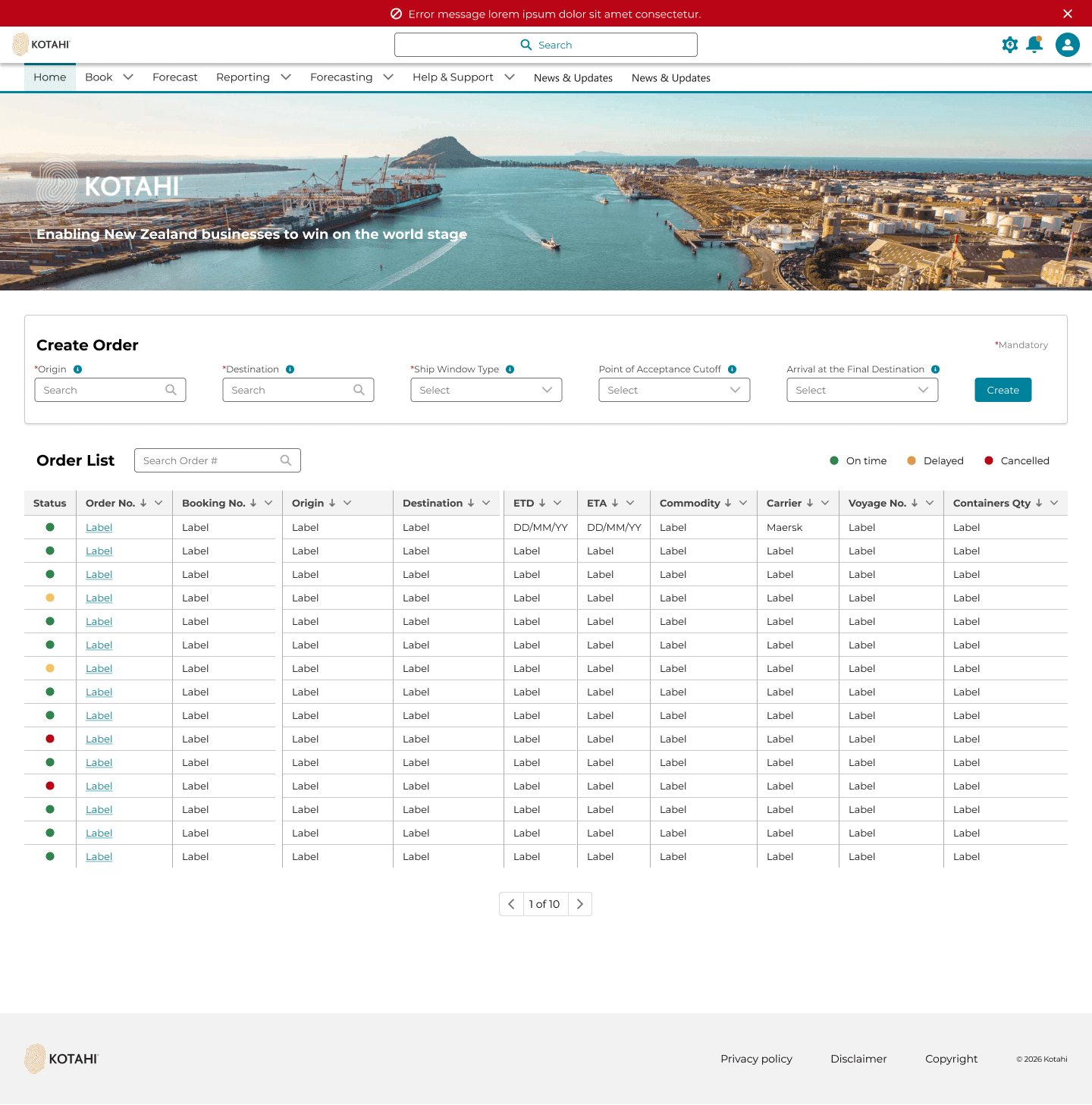
I replaced the one-size form with sequential fields that only appear when they apply.
- Default path for a standard shipment
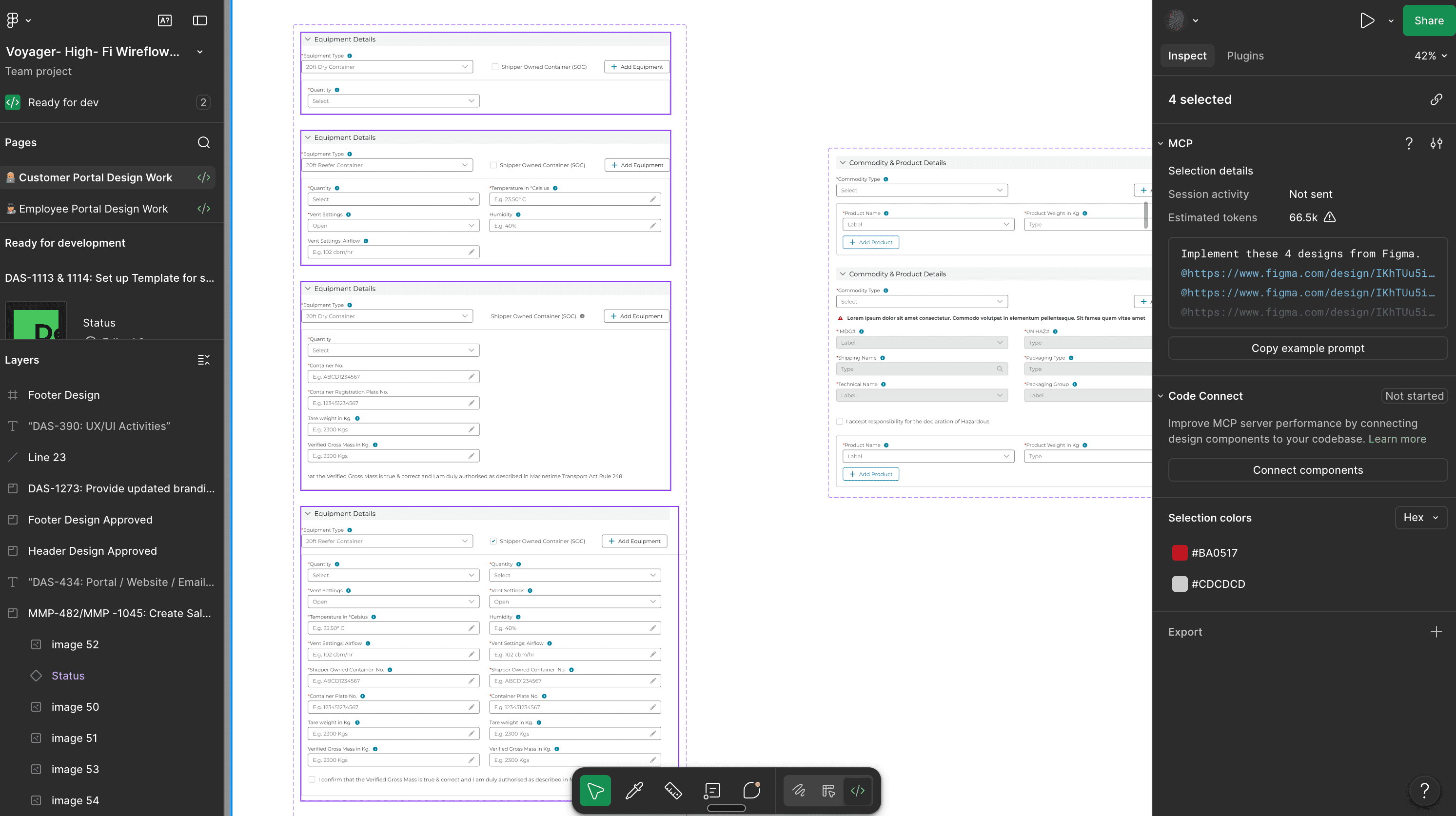
- Extra fields when goods are hazardous under DCSA
- Extra fields when the user picks a reefer container and has their own box
The Figma file used variants so the logic had one source of truth for handoff. Steps: details, then review and confirm.
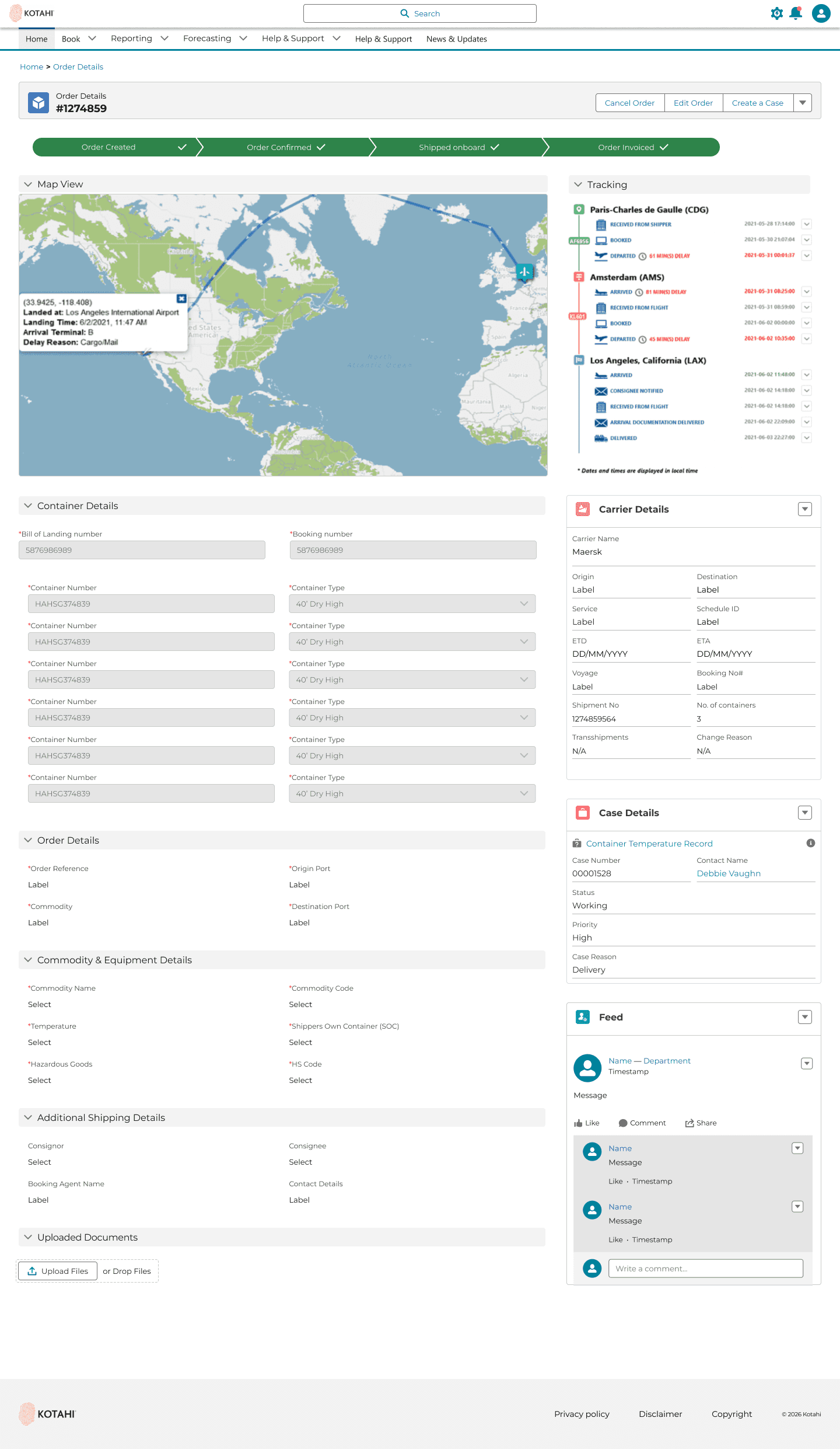
View Order
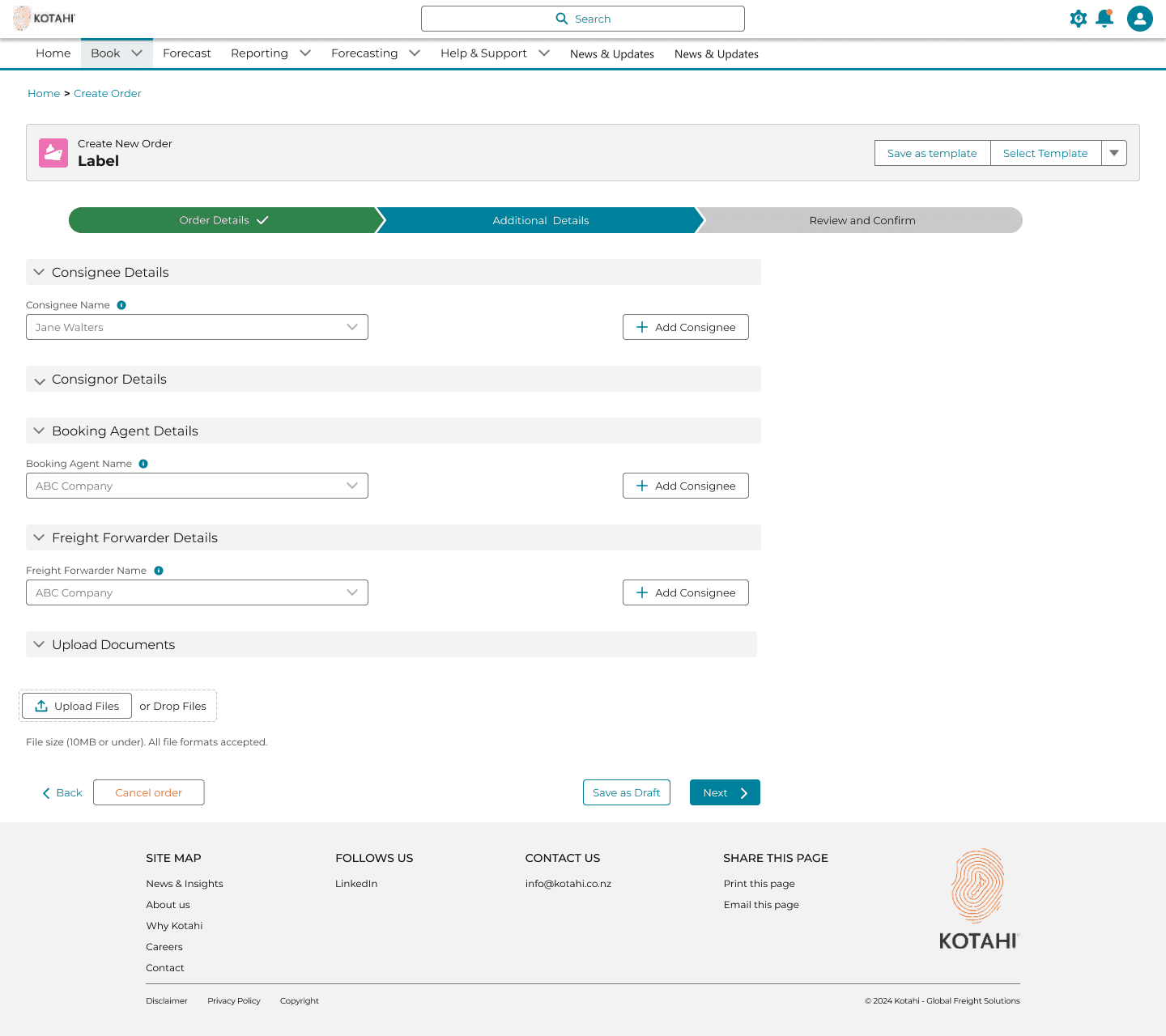
This was the screen exporters did not have. Live status, control, and fewer “where is my shipment?” calls. Order-visibility enquiries dropped 50%.
50%
reduction in order-visibility enquiries
Notifications and disruption banners
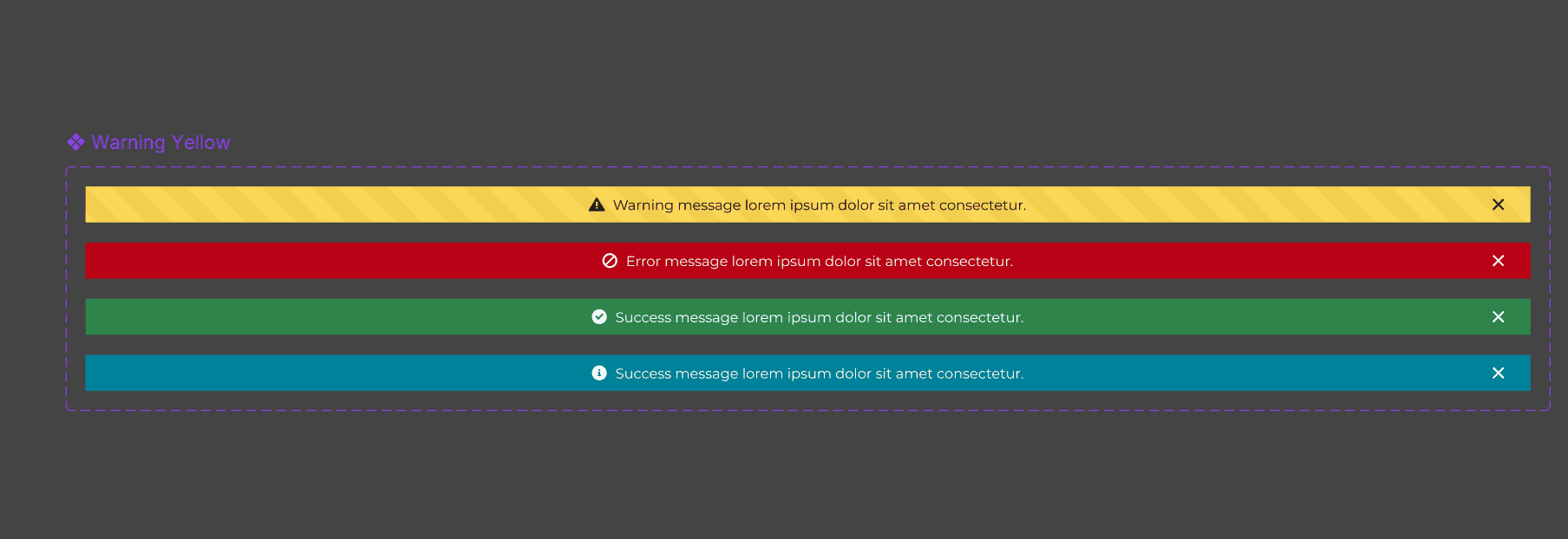
Manual emails became an in-product notification framework. Major events use banner states that change with the scenario, so a disruption is in the portal instead of a missed inbox.
The rest of the portal
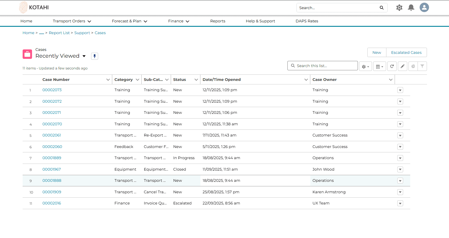
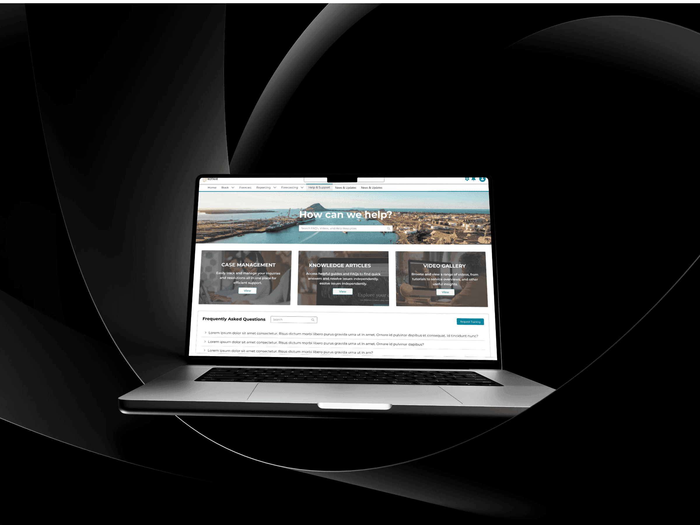
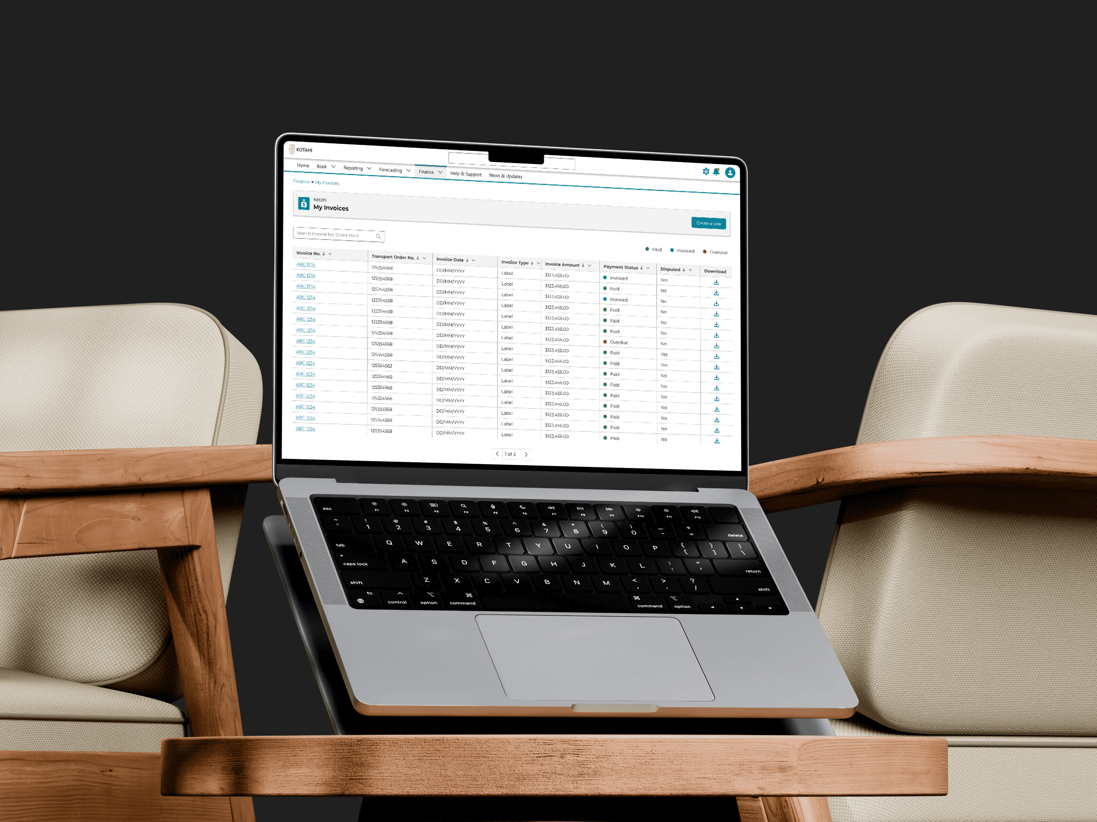
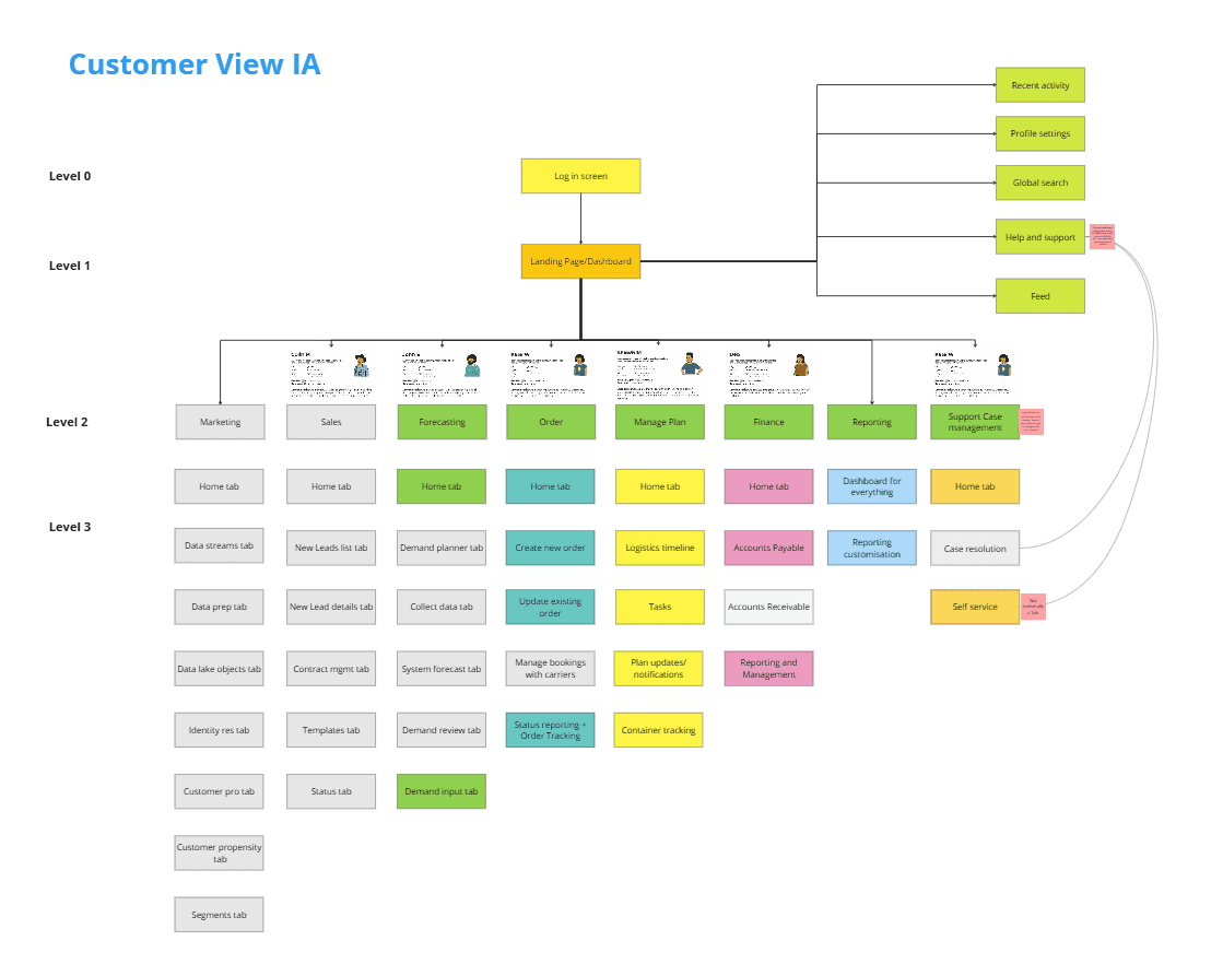
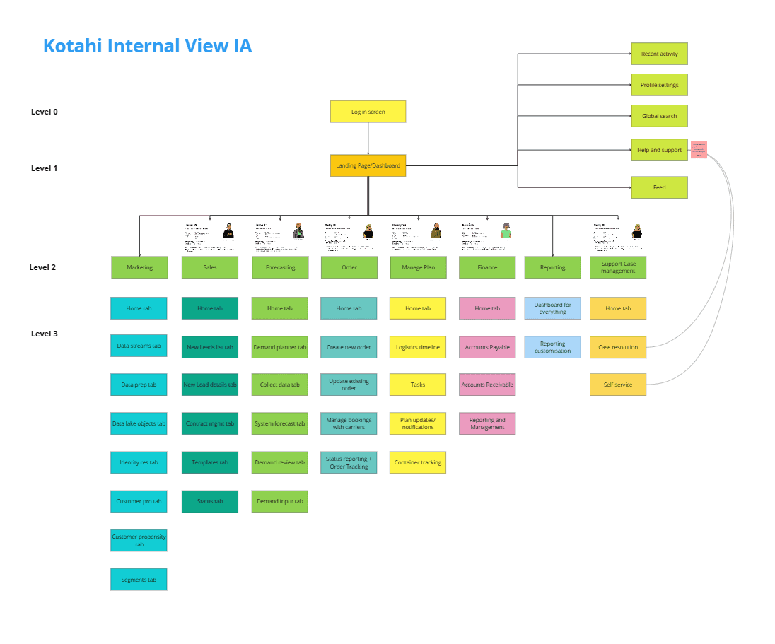
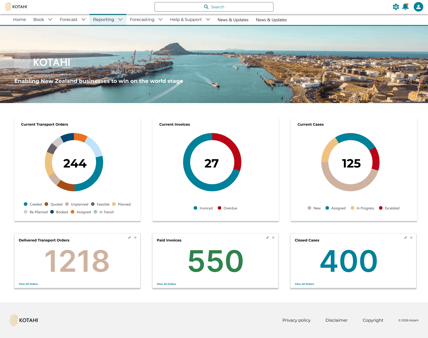
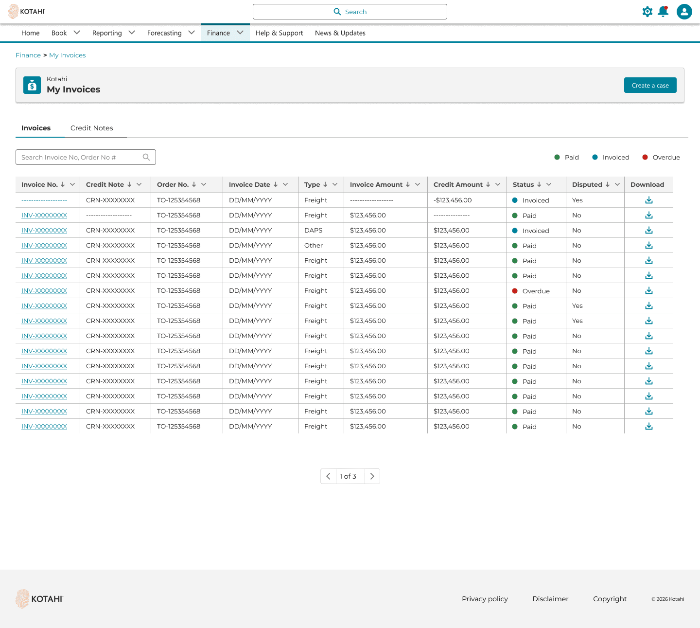
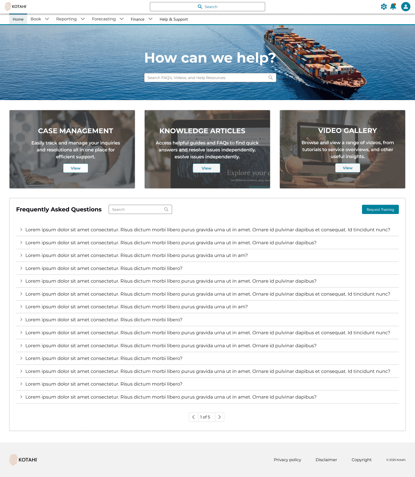
Reporting, invoicing, and help and support shipped in the same customer experience. Information architecture covers the customer portal, a vendor/partner portal, and an internal users portal. Export (NZ to world) and coastal (NZ to NZ) stay as distinct paths.
Design system
Voyager is also where Kotahi got its first design system. Two designers, Salesforce Lightning plus Kotahi brand, component and icon galleries, custom variants. Contrast checked to WCAG AA and AAA.
How it landed with engineering
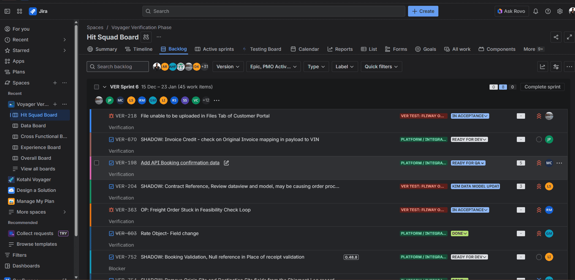
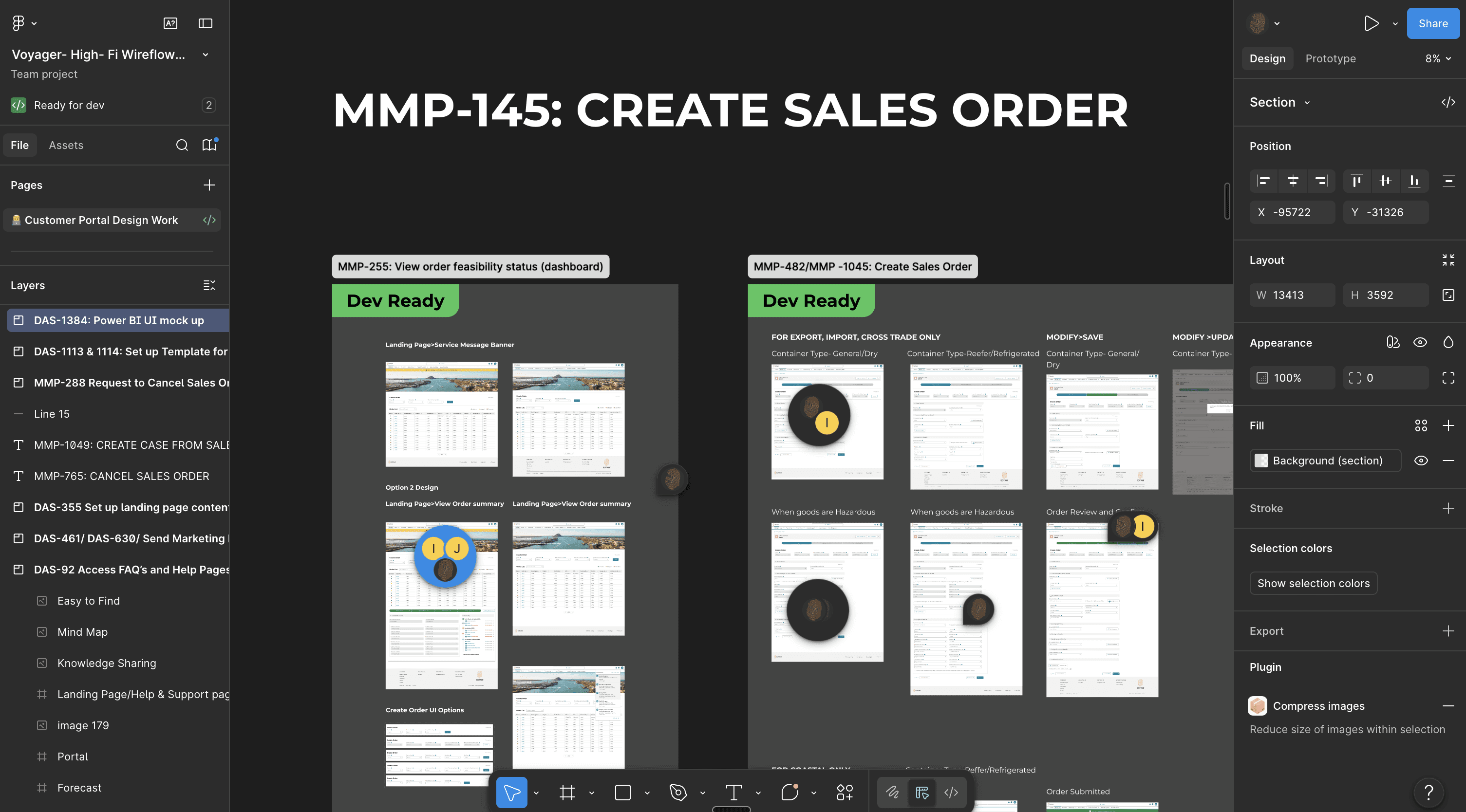
Devs had the Figma files. Frames were tagged Design ready / In Review / Dev Ready and linked to the matching Jira tickets so the PO and engineers were looking at the same work.
Research was interviews and focus groups. I have no stated sample size, so I am not adding one.